react에서 한 페이지 여러개의
토글 버튼 구현하기 입니다.
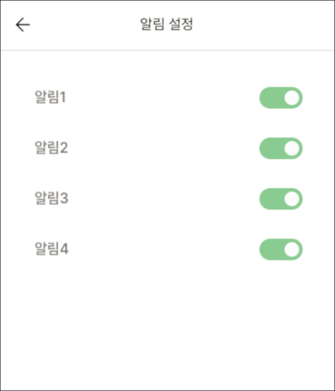
구현화면
구현 영상
부모요소
import React from 'react';
import ToggleBar from "../../components/myInfo/ToggleBar";

const Alarm = () => {
    const datas = [
        { id: 1, title: '알림1', name: 'pushOnRecommendMeal' },
        { id: 2, title: '알림2', name: 'pushOnEatRecord' },
        { id: 3, title: '알림3', name: 'pushOnSymptomRecord' },
        { id: 4, title: '알림4', name: 'pushOnWeeklyReport' },
    ]

    return (
         <section>
            {myInfo && datas.map(data =>
                <ToggleBar key={data.id} data={data} checkStatus={myInfo[data.name]} />
             )}
         </section>
    );
};

export default Alarm;
자식요소 - 하나의 토글
import React, { useState } from 'react';

const ToggleBar = ({ data, checkStatus }) => {
    const [isChecked, setIsChecked] = useState(checkStatus)
    const onCheckToggle = (e) => {
        let params = { userId: loginInfo.userId, [data.name]: !isChecked }
        setIsChecked(!isChecked) //체크 반대로
        //api backend에 params 보내주기
    }


    return (
        <div>
            <div>{data.title}</div>
            <div>
                <label htmlFor={data.title} className={'block overflow-hidden h-6 rounded-full cursor-pointer '
                    + (isChecked ? 'bg-secondary_100' : ' bg-gray_70')}>
                    <input type="checkbox" name={data.title} id={data.title}
                        onChange={e => onCheckToggle(e)}
                        className={'block w-6 h-6 rounded-full bg-gray_100 border-4 outline-none appearance-none cursor-pointer duration-200 ease-in absolute '
                            + (isChecked ? 'translate-x-full border-secondary_100' : 'border-gray_70')} />
                </label>
            </div>
        </div>
    );
};

export default ToggleBar;
반응형
'💻CODING > react. vue' 카테고리의 다른 글
| [react] throttle 적용하기 (0) | 2022.10.04 |
|---|---|
| [react] react-infinite-scroll-component 사용법 (ft. 무한 스크롤) (0) | 2022.09.30 |
| [react] resize 적용하는 법 (0) | 2022.09.13 |
| [react] 하위 컴포넌트별로 특정 요소 on/off 설정 (0) | 2022.09.07 |
| [react] background-image 에 data 넣기 (0) | 2022.09.06 |


댓글