css 레이아웃의 방법,
positon 입니다.
position
position 속성은 요소들을 자유자재로 배치해 주는 속성으로, 이를 이용하면 텍스트나 이미지를 나란히 배치할 수 있고, 가로나 세로로 원하는 위치에 배치할 수도 있습니다.
레이아웃 시, 주로 컨텐츠를 서로 겹치게 배열하거나 마크업 순서와 화면상 배치 순서가 다를 경우에 사용합니다.
position 값
- static: 오소를 이동하거나 겹칠 수 없는 원래 그대로의 상태로 요소를 문서의 흐름에 맞추어 배치합니다.
- relative: relative로 지정된 요소는 left와 top 속성으로 이동할 수 있으며, absolute로 지정된 요소의 부모 역할(깃발)을 합니다.
- absolute: 다른 요소와 겹칠 수 있고, left와 top 속성을 이용하여 부모 박스를 기준으로 원하는 위치를 지정합니다.
- fixed: 요소의 위치를 화면(뷰포트) 기준으로 지정한 위치에 고정해 배치해주며, 구형 브라우저에서는 표현되지 않습니다.
position: absolute
- 문서의 흐름과 상관없이 부모 요소를 기준으로 left, right, top, bottom 속성 값을 이용해 위치를 배치합니다.
- absolute로 지정시 요소가 공중에 떠있는 부유 상태여서, 다른 요소에는 영향을 미치지 않고, 부유한 상태에서 단독적으로 위치를 잡습니다.
- 크기가 100% block 태그의 성격이 사라지며 inline-block과 같이 해당 컨텐츠의 크기만큼만 표시됩니다.
- 반드시 부모 요소가 relative로 지정되어 있어야 합니다.
- 부모 요소가 absolute로 지정돼있어도 상관없습니다. (아래 2번째 예제 참조)
position: absolute 특성
position: relative와 float: left는 함께 쓸 수 있지만, position: absolute와 float: left는 함께 쓸 수 없습니다.
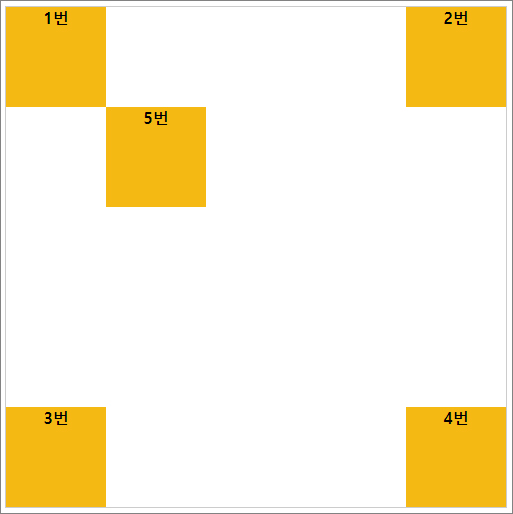
부모 요소가 position: relative 일 경우, 예제
<!doctype html>
<html lang="ko">
<head>
	<meta charset="utf-8">
	<title>postion</title>
	<style>
		#wrap{
			position:relative;
			width:500px;
			height:500px;
			border:1px solid #ccc;
		}
		.box{
			position:absolute;
			width:100px;
			height:100px;
			background:#f5b914;
            text-align: center;
            font-weight: bold;
		}
		.box1 {
			top:0;
			left:0;
		}
		.box2{
			top:0;
			right:0;
		}
		.box3{
			bottom:0;
			left:0;
		}
		.box4{
			bottom:0;
			right:0;
		}
		.box5{
			top:100px;
			left:100px;
		}
	</style>
</head>
<body>
	<div id="wrap">
		<div class="box box1">1번</div>
		<div class="box box2">2번</div>
		<div class="box box3">3번</div>
		<div class="box box4">4번</div>
		<div class="box box5">5번</div>
	</div>
</body>
</html>
화면 결과
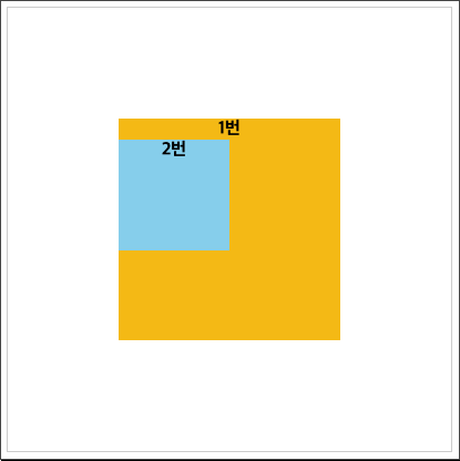
부모 요소가 position: absolute일 경우, 예제
position: absolute 요소의 부모 요소가 absolute로 이미 지정되어 있을 경우가 있습니다.
이 경우, 구조상의 부모 요소를 기준으로 그 안에서 배치가 되기 때문에
부모 요소가 이동하면, 자식도 따라 함께 묶음으로 이동하게 됩니다.
<!doctype html>
<html lang="ko">

  <head>
    <meta charset="utf-8">
    <title>postion</title>
    <style>
      #wrap {
        position: relative;
        width: 400px;
        height: 400px;
        border: 1px solid #ccc;
      }

      .box {
        position: absolute; //부모 요소가 absolute로 지정될 경우
        width: 200px;
        height: 200px;
        top: 100px;
        left: 100px;
        background: #f5b914;
        text-align: center;
        font-weight: bold;
      }

      .inside {
        position: absolute;
        width: 100px;
        height: 100px;
        background: skyblue;
      }

    </style>
  </head>

  <body>
    <div id="wrap">
      <div class="box">1번
        <div class="inside">2번</div>
      </div>
    </div>
  </body>

</html>
화면 결과
화면 보기(Result 클릭)
반응형
'💻CODING > html, css' 카테고리의 다른 글
| [css] 반응형 16:9 비율 유지 박스 컨텐츠 영상 삽입 (4) | 2021.06.04 |
|---|---|
| [css] 반응형 유동적 너비에 따른 이미지 가운데 정렬 방법 (0) | 2021.06.03 |
| [css] position으로 가운데 배치, 정렬 (0) | 2021.05.31 |
| [css] 구글 메터리얼 아이콘 사용 방법(ft. 무료 아이콘 제공 사이트) (0) | 2021.05.30 |
| [css] 구글 폰트 사용법 (ft. google fonts, 무료 웹폰트 적용) (0) | 2021.05.27 |


댓글